
How to Create a Mobile-First Design in Webflow
A guide for those who want to learn how to create a mobile-first design in Webflow. Helping businesses ensure that they are up-to-date with the latest online trends for ranking high in search engines.

In today's world, more and more people are accessing the internet through their mobile devices. This means that designing for mobile devices is more important than ever before. Mobile-first design is a design strategy that puts mobile devices first, ensuring that your website looks great and functions well on smaller screens. In this blog post, we'll explore how to create a mobile-first design in Webflow, a popular website builder that allows you to create responsive designs.
What is Mobile-First Design?
Mobile-first design is a design strategy that prioritises the mobile user experience. This is an approach that is becoming increasingly important as more and more people are accessing the internet through their mobile devices. In fact, mobile devices account for over half of all internet traffic. This means that if you don't design for mobile devices, you're missing out on a significant portion of your potential audience.
So, what is mobile-first design? Simply put, mobile-first design is an approach to web design that starts with designing for mobile screens and then scaling up for larger screens. This approach ensures that the website is optimised for the most common screen size and that the user experience is smooth and intuitive on smaller screens. This is in contrast to the traditional approach of designing for desktop screens and then scaling down for smaller screens.
Why is Mobile-First Design Important?
The importance of mobile-first design cannot be overstated. Google has made mobile-first indexing the default for new websites. This means that websites that are not mobile-friendly may not rank as well in search results.
The benefits of mobile-first design are clear. By designing for mobile devices first, you can ensure that your website is optimised for the most common screen size. This means that your website will be easy to use and navigate on smaller screens, which is where most people are accessing the internet. This can lead to increased engagement and conversions, as users are more likely to stay on your website if it is easy to use on their mobile device.
Another benefit of mobile-first design is that it can help to improve your website's search engine rankings. As mentioned earlier, Google has made mobile-first indexing the default for new websites. If your websites cannot be considered to be mobile-friendly, then it may not rank as well in search results. By designing for mobile devices first, you can ensure that your website is optimised for mobile search, which can help to improve your search engine rankings.

How to Create a Mobile-First Design in Webflow
Start with a Mobile Layout: When designing for mobile-first, it's important to start with a mobile layout. In Webflow, you can create a mobile layout by selecting "Mobile Portrait" from the device dropdown menu in the top-left corner of the Designer. This will give you a blank canvas to start designing your mobile layout.
Prioritise Content: When designing for mobile devices, it's important to prioritise content. This means that you should focus on the most important content and make sure it's easily accessible on smaller screens. You can do this by using larger font sizes, simplifying navigation, and prioritising important content above the fold.
Use a Responsive Grid: Webflow makes it easy to create a responsive grid for your website. This means that your website will automatically adjust to different screen sizes, ensuring that it looks great on any device. To create a responsive grid, simply drag a "Grid" element onto your canvas and adjust the number of columns and gutters to your liking.
Use Breakpoints: Breakpoints are specific screen sizes where the design of your website will change. In Webflow, you can use breakpoints to create different layouts for different screen sizes. This ensures that your website looks great on all devices, from mobile phones to large desktop screens. To add a breakpoint in Webflow, simply click on the "+" icon next to the device dropdown menu in the top-left corner of the Designer.
Test on Different Devices: Once you've designed your mobile-first layout, it's important to test it on different devices. This will ensure that your website looks and functions well on a variety of screen sizes and devices. Webflow makes it easy to test your website on different devices using the Device Preview feature. Simply click on the device icon in the top-right corner of the Designer and select the device you want to preview your website on.
Optimise Images and Videos: Images and videos can be a major source of slow load times on mobile devices. To ensure that your website loads quickly and smoothly on mobile devices, it's important to optimise your images and videos. In Webflow, you can optimise images by selecting the image and clicking on the "Optimise" button in the settings panel. This will compress the image without sacrificing too much quality. You can also optimise videos by using a video hosting service like Vimeo or YouTube, which will automatically optimise the video for different screen sizes.
Use Mobile-Friendly Forms: Forms are an important part of many websites, but they can be difficult to use on mobile devices if they're not designed properly. To create mobile-friendly forms in Webflow, make sure that your form fields are large enough to be easily clicked on and that your submit button is clearly visible. You can also use Webflow's pre-built form elements to save time and ensure that your forms are mobile-friendly.
Consider Mobile-First Interactions: Mobile devices have unique interaction patterns, such as swiping and tapping, that desktop screens do not. When designing for mobile devices, it's important to consider these unique interaction patterns and design your website accordingly. For example, you can use swiping gestures to navigate through a photo gallery or use tapping gestures to expand and collapse menu items.
Use Webflow's Mobile Design Features: Webflow has a number of features specifically designed for mobile design, including the ability to set different font sizes and styles for different screen sizes and the ability to create custom interactions for mobile devices. Take advantage of these features to create a truly mobile-first design.
In conclusion, mobile-first design is essential in today's world, where more people are accessing the internet through their mobile devices. With the rise of mobile usage, it's more important than ever to prioritise the mobile user experience. Fortunately, Webflow makes it easy to create a mobile-first design that looks great and functions well on any device. By using features like responsive grids, breakpoints, and mobile-specific design features, you can create a website that is optimised for mobile devices.
But mobile-first design is not just about aesthetics. It's also about prioritising content and functionality. By prioritising content, you can ensure that your website is easy to navigate and that users can find what they're looking for quickly and easily. Using mobile-friendly forms means that you can make it easy for users to input information on their mobile devices. And by optimising images and videos, we have also found that you can ensure that your website loads quickly and doesn't use up too much data.
So why wait? Start designing your mobile-first website in Webflow today! With its easy-to-use tools and intuitive interface, you can create a website that looks great and functions well on any device. Whether you're designing a website for your business, your personal brand, or just for fun, Webflow is the perfect tool for creating a mobile-first design that will impress your audience and keep them engaged. So what are you waiting for? Get started today and see the results for yourself!
Get started⚡
Supercharge your webflow website
- 🖥️ Unlimited Webflow Development
- 🛠️ Unlimited Tasks (1 active)
- ⏰ 2-3 Day Turnaround
- 📞 Bi-Weekly Calls
- 🤝 Dashboard & Slack Collaboration
- 🔄 Cancel/Pause Anytime
- 🎨 Webflow Dev + Figma Design
- 🛠️ Unlimited Tasks & Projects (1 active)
- ⏰ 1-3 Day Turnaround
- 📞 Bi-Weekly Calls
- 🤝 Dashboard & Slack Collaboration
- 🔄 Cancel/Pause Anytime
10% OFF
£9.45k billed quarterly
- 🖥️ Unlimited Webflow Development
- 🛠️ Unlimited Tasks (1 active)
- ⏰ 2-3 Day Turnaround
- 📞 Bi-Weekly Calls
- 🤝 Dashboard & Slack Collaboration
- 🔄 Cancel/Pause Anytime
10% OFF
£10.8k billed quarterly
- 🎨 Webflow Dev + Figma Design
- 🛠️ Unlimited Tasks & Projects (1 active)
- ⏰ 1-3 Day Turnaround
- 📞 Bi-Weekly Calls
- 🤝 Dashboard & Slack Collaboration
- 🔄 Cancel/Pause Anytime
- 💸 Competitive pricing
- 📉 More hours = lower price
- 🎨 Design and development
- 📊 Updates via our dashboard

Recommend him to anyone!"

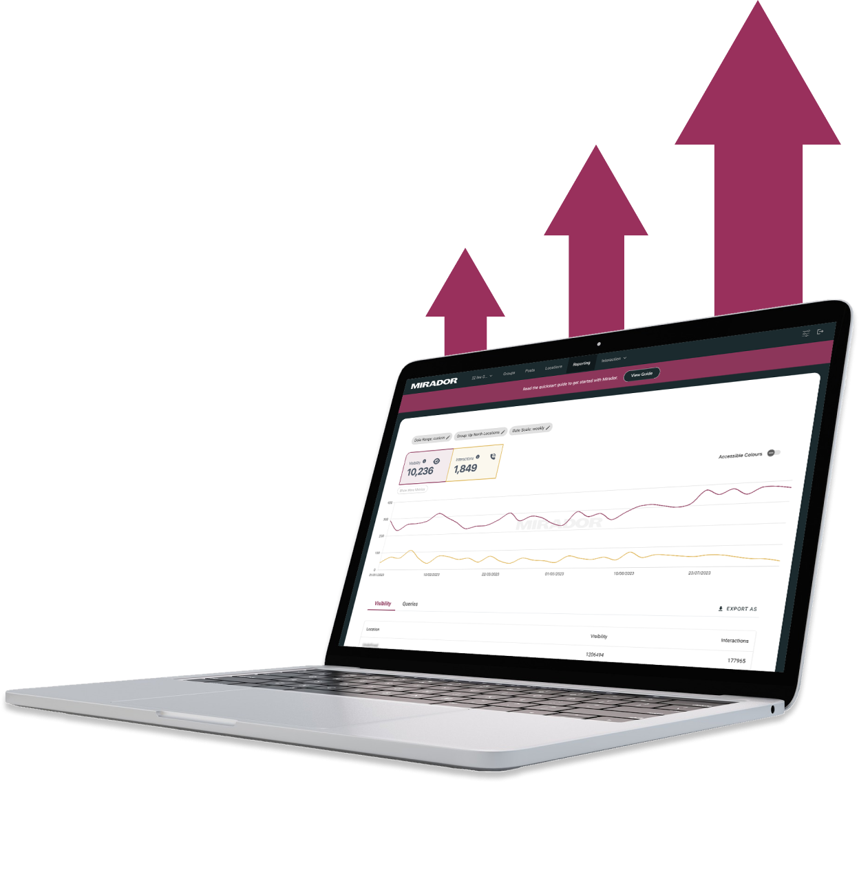
Thanks to Hilvy's expertise and hard work, Mirador Local now has a modern, user-friendly website that perfectly reflects our brand and enhances the overall user experience. I highly recommend them to anyone seeking a talented and reliable designer for their next project."

Gerry White
Global Growth @ Mirador

They didn't stop until the site perfectly matched our design vision, even going past our project timeline to ensure this level of quality. We would definitely work with them again!"

John Outwater
Data Visualization at Renoster
Their communication throughout the project was great and I received frequent updates and the ability to give feedback. It felt like a team effort and the results were fantastic. Hilvy did a great job at bring our idea to life. Would highly recommend"

Marcus Vitelli
Brand Executive at Flexciton
He really knows the ins and outs of Webflow - it's no wonder that he's a certified Webflow Expert! I'm looking forward to the day when I get to work with him again.

Diana Donaldson
CEO, Be Indigo
-p-500.png)
The team was also very responsive and willing to help, will highly recommend for your website projects! :)"

My website continually evolves to meet the demands of my clients and my offerings, which is fantastic. Hilvy also brings fresh ideas and insights on how to enhance and grow in alignment with my objectives and business requirements. I'm excited to see how this new phase unfolds."

Karin Young
Psychotherapist, Karin Counselling

They also remained really patient with us throughout and gave us great advice on how to set ourselves up for the long term, and then also gave us some valuable training on Webflow, upskilling our team. We had a clear way of providing changes and feedback via a tool he suggested which worked really well, the process was smooth. If you're a start up or scale up looking for an excellent web developer to turn your ideas into reality, look no further!!"

Ben Leftley
Senior Delivery Manager at Unmind
Their excellent blend of technical and visual knowledge helped us create a fast, SEO-optimized site that looks fantastic and stays true to our brand. We would gladly hire Hilvy again!"

Eliza Gerland
Strategic Marketer @ UFODrive
Throughout the process, they patiently addressed all questions that arose during our platform transition, delivering not only an exceptional site but also tutorials on managing it."

Their design expertise is outstanding, and they were able to craft a bespoke, feature-rich website that looks fantastic and functions seamlessly. I wholeheartedly recommend Hilvy to anyone seeking webflow designers who truly understand their craft!"

Taita Ngetich
CEO @ Synnefa

Miles Owen
Their Webflow development expertise is top-notch, and they effortlessly keep up with the dynamic nature of early-stage startups."

Growth at Briink


Marketing Lead @ Provenance
My website continually evolves to meet the demands of my clients and my offerings, which is fantastic. Hilvy also brings fresh ideas and insights on how to enhance and grow in alignment with my objectives and business requirements. I'm excited to see how this new phase unfolds."
Karin Young
Psychotherapist, Karin Counselling
Their design expertise is outstanding, and they were able to craft a bespoke, feature-rich website that looks fantastic and functions seamlessly. I wholeheartedly recommend Hilvy to anyone seeking webflow designers who truly understand their craft!"
Taita Ngetich
CEO @ Synnefa
Their Webflow development expertise is top-notch, and they effortlessly keep up with the dynamic nature of early-stage startups."
Growth at Briink
Throughout the process, they patiently addressed all questions that arose during our platform transition, delivering not only an exceptional site but also tutorials on managing it."

Their mastery of Webflow is unquestionable – it's no surprise that they are certified Webflow Experts! I eagerly anticipate the opportunity to work with them again."

Diana Donaldson

Their excellent blend of technical and visual knowledge helped us create a fast, SEO-optimized site that looks fantastic and stays true to our brand. We would gladly hire Hilvy again!"
Eliza Gerland
Strategic Marketer @ UFODrive
%201.svg)


Design & build...
I love to solve complex problems for start-ups & companies through great webflow web design & development. 🎉


