Back to Insights
Guides5 mins

How to Create a Mobile-First Design in Webflow

A guide for those who want to learn how to create a mobile-first design in Webflow. Helping businesses ensure that they are up-to-date with the latest online trends for ranking high in search engines.

How to Create a Mobile-First Design in Webflow

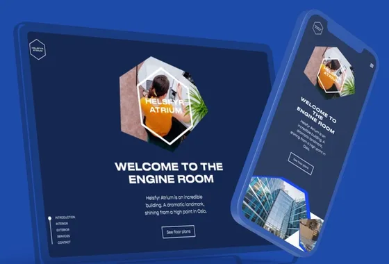
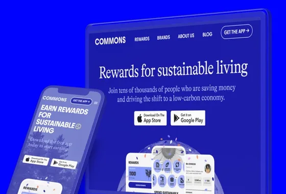
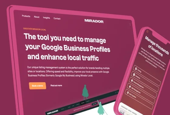
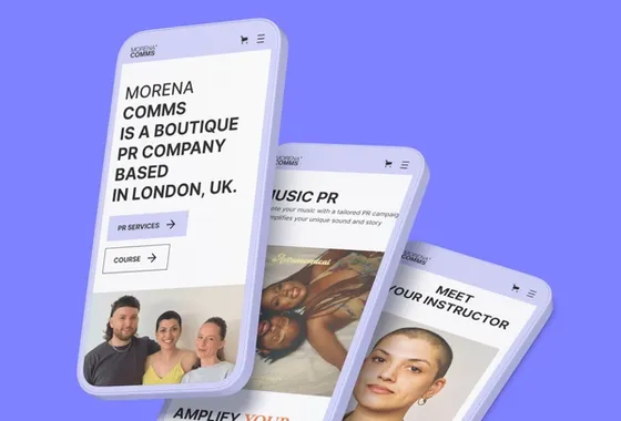
In today's world, more and more people are accessing the internet through their mobile devices. This means that designing for mobile devices is more important than ever before. Mobile-first design is a design strategy that puts mobile devices first, ensuring that your website looks great and functions well on smaller screens. In this blog post, we'll explore how to create a mobile-first design in Webflow, a popular website builder that allows you to create responsive designs.

What is Mobile-First Design?

Mobile-first design is a design strategy that prioritises the mobile user experience. This is an approach that is becoming increasingly important as more and more people are accessing the internet through their mobile devices. In fact, mobile devices account for over half of all internet traffic. This means that if you don't design for mobile devices, you're missing out on a significant portion of your potential audience.

So, what is mobile-first design? Simply put, mobile-first design is an approach to web design that starts with designing for mobile screens and then scaling up for larger screens. This approach ensures that the website is optimised for the most common screen size and that the user experience is smooth and intuitive on smaller screens. This is in contrast to the traditional approach of designing for desktop screens and then scaling down for smaller screens.

Why is Mobile-First Design Important?

The importance of mobile-first design cannot be overstated. Google has made mobile-first indexing the default for new websites. This means that websites that are not mobile-friendly may not rank as well in search results.

The benefits of mobile-first design are clear. By designing for mobile devices first, you can ensure that your website is optimised for the most common screen size. This means that your website will be easy to use and navigate on smaller screens, which is where most people are accessing the internet. This can lead to increased engagement and conversions, as users are more likely to stay on your website if it is easy to use on their mobile device.

Another benefit of mobile-first design is that it can help to improve your website's search engine rankings. As mentioned earlier, Google has made mobile-first indexing the default for new websites. If your websites cannot be considered to be mobile-friendly, then it may not rank as well in search results. By designing for mobile devices first, you can ensure that your website is optimised for mobile search, which can help to improve your search engine rankings.

How to Create a Mobile-First Design in Webflow

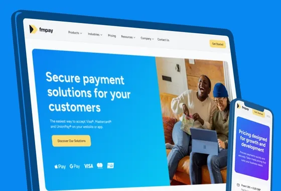
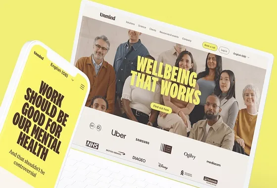
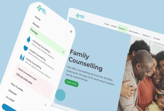
Start with a Mobile Layout: When designing for mobile-first, it's important to start with a mobile layout. In Webflow, you can create a mobile layout by selecting "Mobile Portrait" from the device dropdown menu in the top-left corner of the Designer. This will give you a blank canvas to start designing your mobile layout.

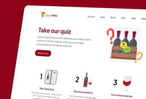
Prioritise Content: When designing for mobile devices, it's important to prioritise content. This means that you should focus on the most important content and make sure it's easily accessible on smaller screens. You can do this by using larger font sizes, simplifying navigation, and prioritising important content above the fold.

Use a Responsive Grid: Webflow makes it easy to create a responsive grid for your website. This means that your website will automatically adjust to different screen sizes, ensuring that it looks great on any device. To create a responsive grid, simply drag a "Grid" element onto your canvas and adjust the number of columns and gutters to your liking.

Use Breakpoints: Breakpoints are specific screen sizes where the design of your website will change. In Webflow, you can use breakpoints to create different layouts for different screen sizes. This ensures that your website looks great on all devices, from mobile phones to large desktop screens. To add a breakpoint in Webflow, simply click on the "+" icon next to the device dropdown menu in the top-left corner of the Designer.

Test on Different Devices: Once you've designed your mobile-first layout, it's important to test it on different devices. This will ensure that your website looks and functions well on a variety of screen sizes and devices. Webflow makes it easy to test your website on different devices using the Device Preview feature. Simply click on the device icon in the top-right corner of the Designer and select the device you want to preview your website on.

Optimise Images and Videos: Images and videos can be a major source of slow load times on mobile devices. To ensure that your website loads quickly and smoothly on mobile devices, it's important to optimise your images and videos. In Webflow, you can optimise images by selecting the image and clicking on the "Optimise" button in the settings panel. This will compress the image without sacrificing too much quality. You can also optimise videos by using a video hosting service like Vimeo or YouTube, which will automatically optimise the video for different screen sizes.

Use Mobile-Friendly Forms: Forms are an important part of many websites, but they can be difficult to use on mobile devices if they're not designed properly. To create mobile-friendly forms in Webflow, make sure that your form fields are large enough to be easily clicked on and that your submit button is clearly visible. You can also use Webflow's pre-built form elements to save time and ensure that your forms are mobile-friendly.

Consider Mobile-First Interactions: Mobile devices have unique interaction patterns, such as swiping and tapping, that desktop screens do not. When designing for mobile devices, it's important to consider these unique interaction patterns and design your website accordingly. For example, you can use swiping gestures to navigate through a photo gallery or use tapping gestures to expand and collapse menu items.

Use Webflow's Mobile Design Features: Webflow has a number of features specifically designed for mobile design, including the ability to set different font sizes and styles for different screen sizes and the ability to create custom interactions for mobile devices. Take advantage of these features to create a truly mobile-first design.

In conclusion, mobile-first design is essential in today's world, where more people are accessing the internet through their mobile devices. With the rise of mobile usage, it's more important than ever to prioritise the mobile user experience. Fortunately, Webflow makes it easy to create a mobile-first design that looks great and functions well on any device. By using features like responsive grids, breakpoints, and mobile-specific design features, you can create a website that is optimised for mobile devices.

But mobile-first design is not just about aesthetics. It's also about prioritising content and functionality. By prioritising content, you can ensure that your website is easy to navigate and that users can find what they're looking for quickly and easily. Using mobile-friendly forms means that you can make it easy for users to input information on their mobile devices. And by optimising images and videos, we have also found that you can ensure that your website loads quickly and doesn't use up too much data.

So why wait? Start designing your mobile-first website in Webflow today! With its easy-to-use tools and intuitive interface, you can create a website that looks great and functions well on any device. Whether you're designing a website for your business, your personal brand, or just for fun, Webflow is the perfect tool for creating a mobile-first design that will impress your audience and keep them engaged. So what are you waiting for? Get started today and see the results for yourself!

Selected Work

People Connect iPRES with Saenty's
Farming Software for the Modern Farmer with Synnefa
Karin Young
Karin Young
Fund a better future, confidently with Briink
Radically Better Car Rental with UFO Drive
Secure payment solutions with FMpay
Wellbeing that Works with Unmind
Real Time Measurement with IP Cameras CurbFlow
Christian confidential counselling
Unmind
Unmind
A fine wine tasting community platform
Commercial property development website for Helsfyr Atrium
An environmental tech company reducing Co2 worldwide
Clinical trials with WithPower
DeskLodge meeting spaces
Body by Ciara's fitness subscription platform
Luxury Raffles properties from Singapore to Seychelles
Sustainability marketing technology by Provenance
NFT Marketplace app & website design
Creative Education With Glasgow School of Arts
Well-being website for Karin's therapy.
Automated e-commerce web app for AltSignals crypto and forex signals.
Web design & digital marketing agency.
The Fresh Nursery School website.
A Wildlife Vets charity providing critical veterinary support
Creative and commercial Media Foundry at Talenthouse
Provenance
Provenance
Supporting businesses & building brands
Defi, Acceleration & Growth Investment Group
Hosted desktops in the UK powering small businesses
Index Signals for Telegram
Gregg Martin is a Comedy Central actor, writer, producer & content creator
ApexBull Forex education platform for an ex-wall street professional
Precix mobility wearables
FMpay
FMpay
Flexciton smart scheduling
A review platform of curated forex and crypto providers
Renoster
Renoster
Smart homes with Novus Electrical
UFODrive
UFODrive
Eden Bloom funeral care
Precix
Precix
Landing for CasisDead, DeadCorp AGHAST6
JOOR wholesale fashion
Climate Action with Commons.earth
Mirador Local manage business profiles
Rainforest carbon projects with Renoster
UK Care Management with Log my Care
VC Finance with Tech CFO
Morena Comms, a PR company in London
Paid social with Aura Ads

Want this built, not just read about?

We turn insights like this one into shipped Webflow systems. Book a 15-min call — we'll scope it together.

Derrick
Abdul
Bunmi
Farwa
Joshua
Nitin
Samuel

Your project is in the right hands

A wealth of experience across a range of disciplines — from front-end development and backend engineering to QA, strategy, and beyond.

7 specialists·50+ projects·5★ rated