A storefront can look excellent and still make buying difficult. The visitor may not understand the product, find the right option or see the delivery cost until late in the journey. Ecommerce web design needs to connect presentation with the decisions that lead to a purchase.
Start by inspecting the journey from product discovery to checkout. Use real customer questions and available behaviour data. Do not assume a visual redesign will fix catalogue, fulfilment or policy problems that sit behind the page.
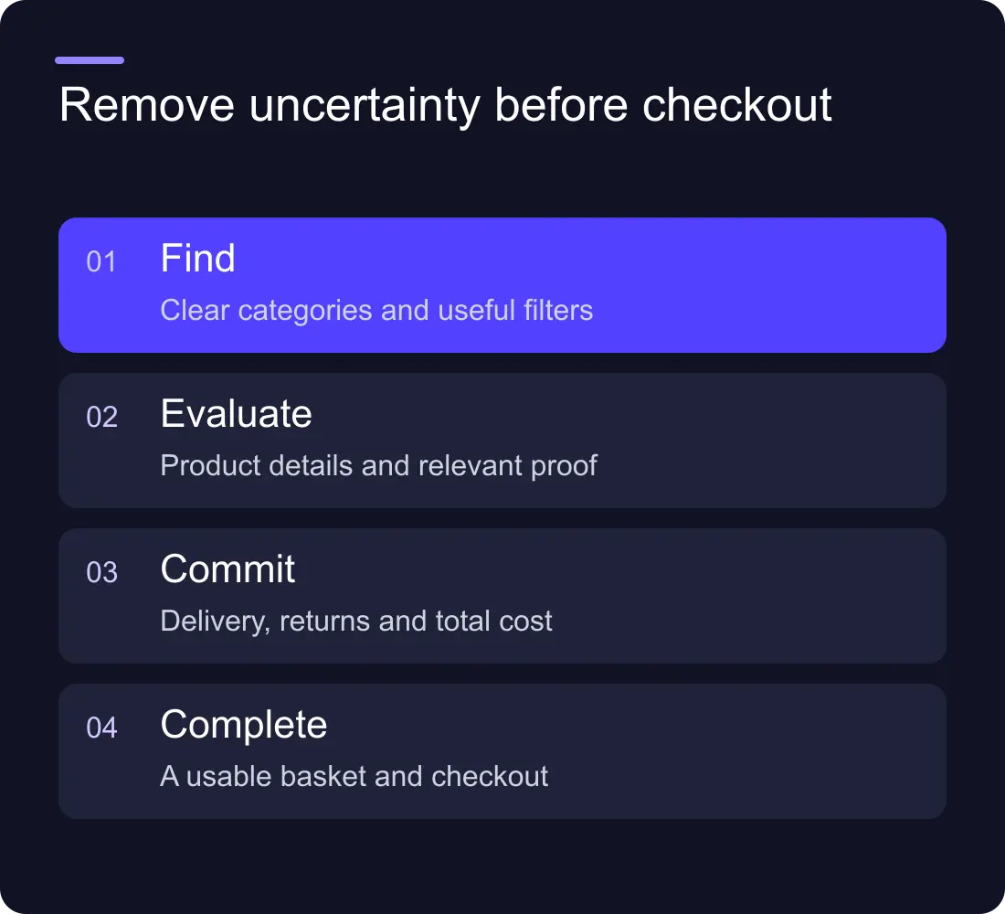
Help people find the right product
Use categories and filters that match how customers choose. Internal product families can be useful for stock management but confusing as the main navigation. Give unfamiliar visitors a route based on need, use or meaningful attributes.
Check search results for common terms, misspellings and out-of-stock products. A zero-results screen should offer useful next steps rather than ending the journey. Decide how unavailable items, alternatives and restocking information appear.
Keep product names and options consistent across listings, details and the basket. Small naming differences can make someone wonder whether they selected the intended item.
Make the product page answer buying questions
Show the information needed to judge fit: dimensions, materials, compatibility, care, contents or other relevant details. Choose images that explain the product as well as creating atmosphere. An attractive crop may not show scale or an important connection.
Make variants clear. If a choice changes price, availability or an image, the interface should reflect it. Test with long option names and a small screen rather than only the simplest product in the catalogue.
Use accurate evidence and permitted reviews. Do not create testimonials, scarcity counters or performance claims to make the template look complete.
Put delivery and returns information within reach
Explain relevant delivery options, costs and conditions early enough to support a decision. Keep policy language understandable and consistent with what the business can fulfil.
If a product has special restrictions or a longer lead time, place that information near the choice. A generic footer policy is not enough when the condition affects a specific purchase.
Check the actual operational process with the team. Design cannot make a promised delivery date accurate if the stock or fulfilment system cannot support it.
Review the basket as a decision point
The basket should make the selected products, options, quantities and known costs easy to inspect. Let people correct a mistake without starting again. Preserve their work where the platform and privacy policy allow it.
Avoid distractions that make the next step harder to find. Cross-sells can be useful when they are relevant, but they should not conceal the checkout or introduce uncertainty about the current order.
Test the route from a product page through the basket on a phone. Check sticky elements, keyboard input, quantity changes and error states. A small control that looks elegant on desktop can be frustrating with touch.
Choose the platform around operations
List the commerce requirements before choosing a storefront builder: catalogue structure, variants, inventory, markets, payments, fulfilment and integrations. Distinguish a marketing website with a few purchasing links from an operational online store.
Use Shopify's theme documentation when assessing how its storefront system is organised, and read the Webflow vs Shopify comparison for the wider platform decision. Verify current plan and integration details directly before committing.
If the marketing site and store use different systems, design the boundary deliberately. Visitors should understand where they are, and the team needs clear ownership of content, analytics and catalogue changes.
Test and measure without guessing the cause
Check the full journey with representative products and payment test modes where available. Include an invalid address, unavailable option, failed payment and return to the basket. Record the expected behaviour and what happened.
Use funnel data to choose an investigation, not to declare the cause automatically. A drop between basket and checkout can involve pricing, delivery, payment options or tracking. Combine the data with real journey review and customer questions.
Change a meaningful part, annotate the release and compare an appropriate period. Avoid promising a conversion gain from a design change before the result is measured.
Should we redesign the whole store to improve sales?
Not necessarily. A clear product page, better option selection or earlier delivery information may address the main friction. Investigate the journey before choosing the scale of work.
Is visual quality still important?
Yes. It helps communicate the product and business. It works best when paired with clear information, credible evidence and a dependable buying process.
Explore Hilvy's website services, SEO and conversion work and recent projects.