
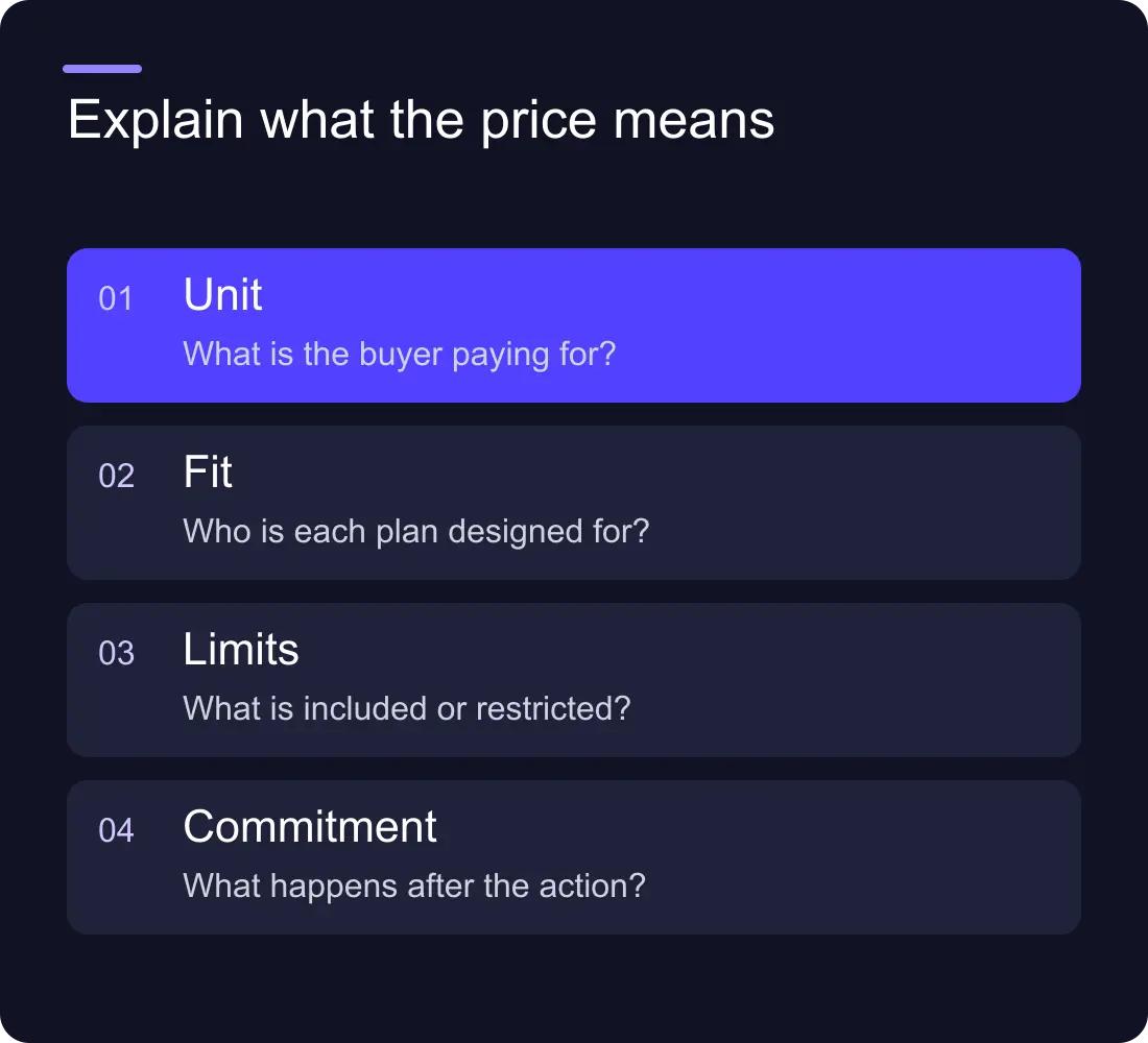
A useful SaaS pricing page explains what the price means: who each plan suits, what the billing unit is, which limits matter and what happens next. The design should make those answers easy to compare before asking someone to start a trial or book a call.
Three attractive pricing cards are not enough if the buyer cannot work out whether five users means five seats, five active users or five administrators. Pricing clarity begins with the commercial model, not the card layout.
Answer the questions behind the number
Buyers need to know what they are buying and whether the offer fits their situation. Start with the billing unit, included usage, important exclusions, commitment and route to purchase.
Use concrete language. “Per workspace” needs an explanation of what counts as a workspace. “Usage-based” needs an explanation of the measured activity. “Contact sales” needs a reason and an expectation about the conversation.
Do not hide those details in a tooltip that is awkward to use on mobile. Put the information needed to interpret the price close to the price. Secondary detail can live further down the page, but the basic model should be clear immediately.
Name plans around a useful distinction
Plan names can express the brand, but they still need a practical explanation. A visitor should understand the difference between the options without decoding clever labels.
Give each plan a short audience or task description. For example, a fictional collaboration tool might distinguish a single team, several coordinated teams and a business needing procurement support. Those distinctions help someone compare their situation with the offer.
Avoid marking a plan as most popular unless you have evidence and permission to make that claim. A recommendation can instead say who the plan is designed for. That is both more useful and easier to keep accurate.
A worked example: clarify the billing unit
Imagine a fictional workflow product charging by active workspace. This article does not propose an actual price. It uses the product to illustrate the explanation a page needs.
| Buyer question | Weak explanation | Clearer explanation |
|---|---|---|
| What is a workspace? | One workspace included | One shared environment for a team and its projects |
| Who can join? | Team access | Explain which roles and users the plan includes |
| What counts as usage? | Generous usage | Name the measured activity and its limit |
| What happens at the limit? | Upgrade available | Explain the restriction, notification and upgrade route |
| Can we leave? | Flexible plans | Explain the commitment and cancellation process |
The clearer column still needs the product owner's confirmed policy. Design should expose the unanswered question rather than invent a reassuring answer.
Make comparison work without perfect memory
Keep comparable features in the same order across plans. Use consistent units and labels. If a feature is available at different limits, show the difference rather than repeating Included in every card.
A comparison table can help with detailed evaluation, but it needs readable labels and a usable small-screen treatment. Test whether a visitor can identify the row and the plan when scrolling. A wide table that loses both labels is technically present but practically difficult to use.
Lead with the differences that affect the decision. A long list of identical minor features can bury the few limits that matter. Put detailed documentation behind an accurately labelled link when the explanation needs more space.
Explain the next step honestly
A trial, demo and sales conversation are different actions. Label the button for the action that actually follows. If a trial requires payment information, say so where the visitor can see it before committing.
If a sales conversation is necessary because the product requires configuration, procurement or a bespoke scope, explain that. Give the buyer something useful to prepare, such as expected team size or integration needs.
You can also provide a product demo for people who need to understand the workflow before discussing price. The demo should support the decision rather than become another unexplained hurdle.
Use FAQs for real purchase questions
Good pricing FAQs answer questions that would otherwise block evaluation: annual billing, cancellation, usage limits, onboarding, security review or a change in team size. The answers must reflect confirmed policies.
Keep important restrictions in the main comparison as well. An FAQ should clarify the offer, not conceal a condition that changes its meaning. Avoid answers that say contact us to every basic question.
Structured data should match the visible content. Google has retired FAQ rich results, so FAQ markup is not a promise of an expanded Google listing. The immediate benefit of a good answer is helping a buyer understand the offer.
Evaluate clarity before evaluating button clicks
A pricing page can produce more clicks while creating worse expectations. Review what happens after the action: trial activation, suitable enquiries and questions the sales team repeatedly has to correct.
Ask someone unfamiliar with the product to explain the billing unit and choose a plan for a realistic scenario. If they cannot explain the choice, revise the information before testing a button colour.
When changing the page, record what changed and keep the commercial offer consistent across the website, onboarding and sales materials. A pricing experiment is hard to interpret if the same plan means different things in different places.
Keep the page maintainable
Assign an owner to prices, limits and policies. Keep repeated information in a shared source where the implementation supports it, and add a release checklist for commercial changes.
Check the cards, comparison table, FAQs, signup flow and any linked proposal material together. The website should not advertise an old limit while the product enforces a new one.
If the wider site also struggles to explain the product, start with homepage messaging. Clear pricing depends on visitors understanding the job the product does.
Frequently asked questions
What should a SaaS pricing page include?
Include the billing unit, plan audience, meaningful differences, important limits, commitment and next step. Add policy answers that help buyers evaluate the offer, using information confirmed by the product owner.
Should we show prices or use contact sales?
Choose the route that matches the commercial model. If pricing can be explained clearly, showing it can support evaluation. If scope requires a conversation, explain why and what the buyer can expect from it.
Do we need a long feature comparison table?
Only when it helps buyers understand meaningful differences. Start with the features and limits that affect the decision. Keep any detailed table readable on small screens and consistent with the plan cards.
How should we test a pricing page?
First test whether people understand the offer and can choose a suitable plan. Then review the resulting trials or enquiries, not just clicks. Record commercial changes separately from presentation changes.