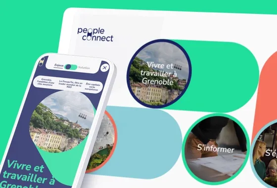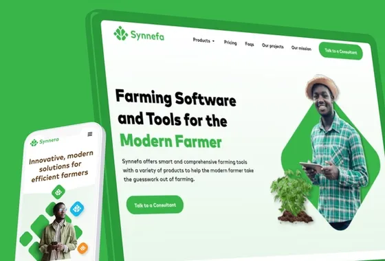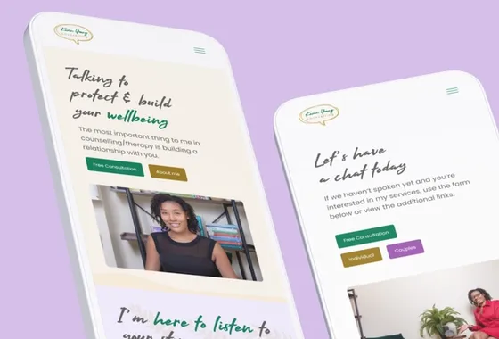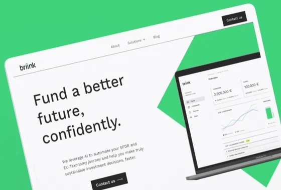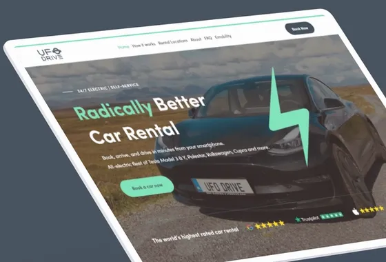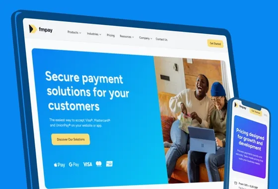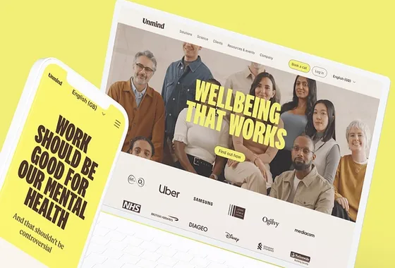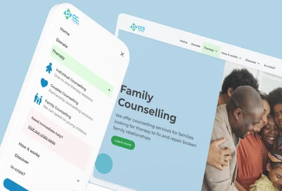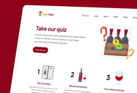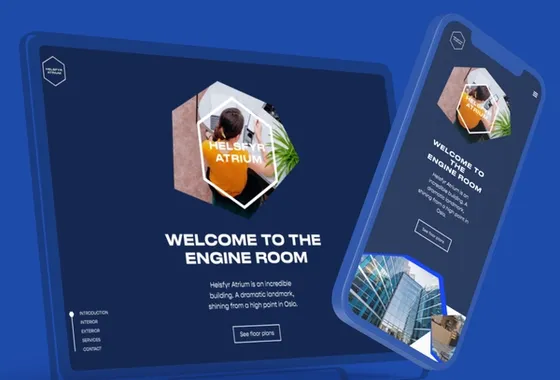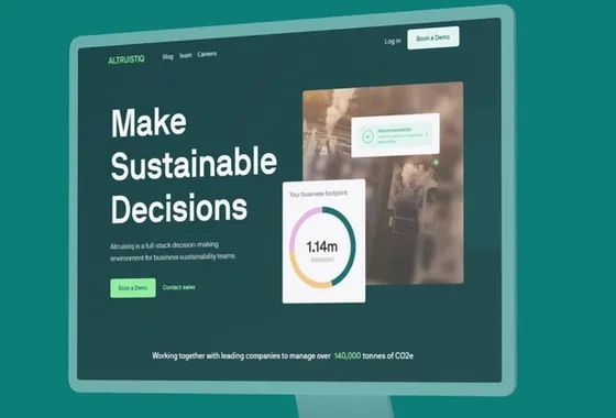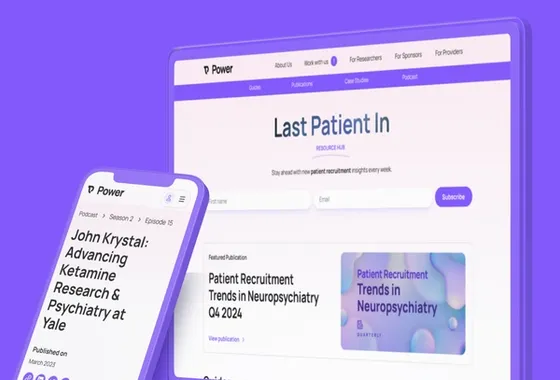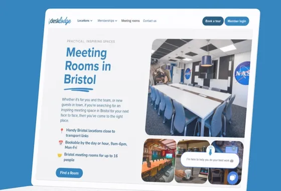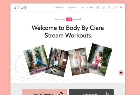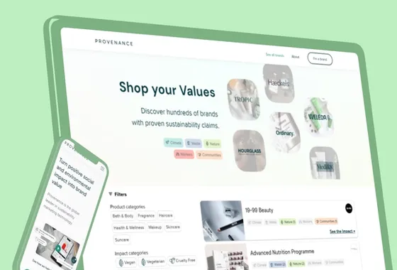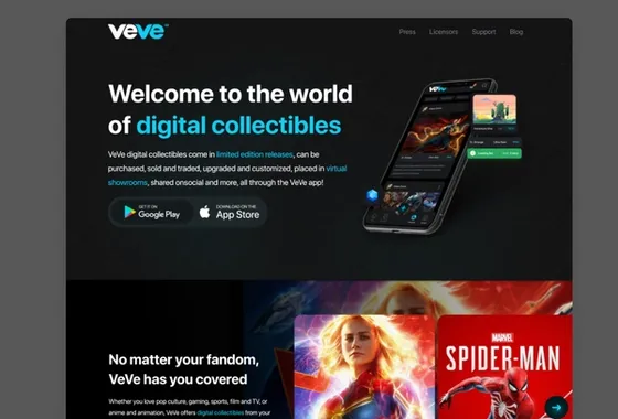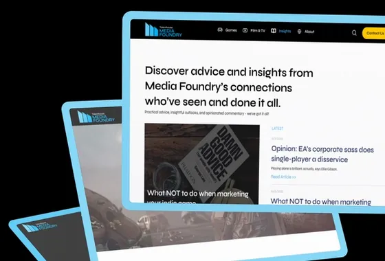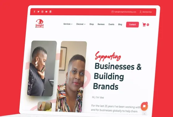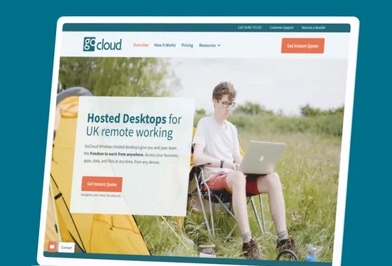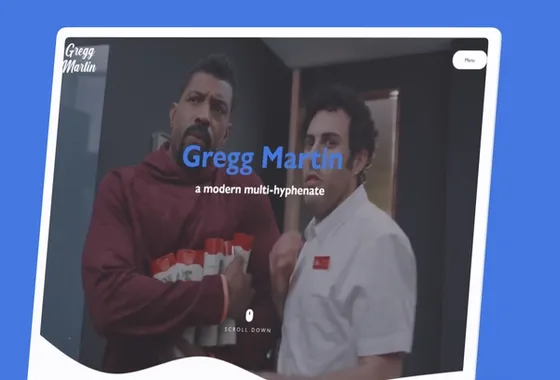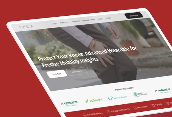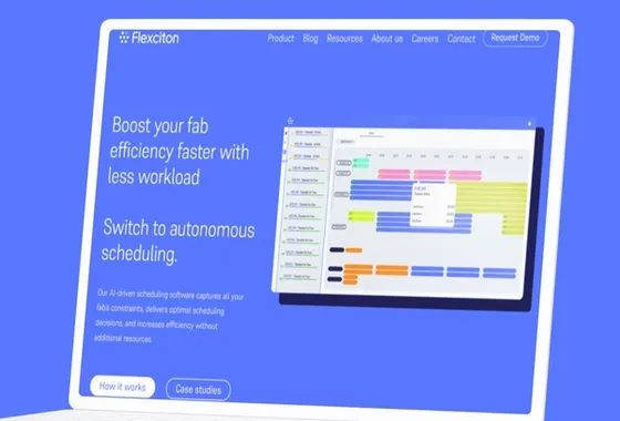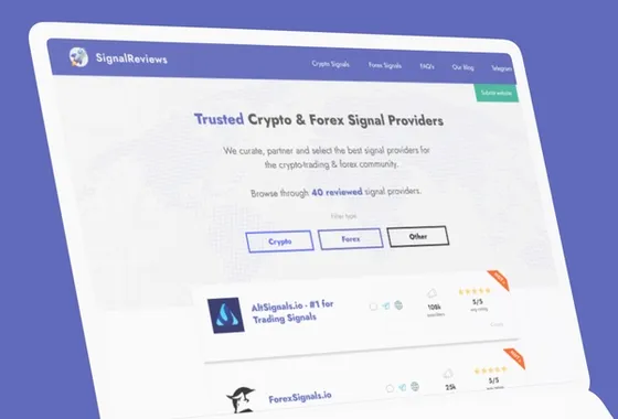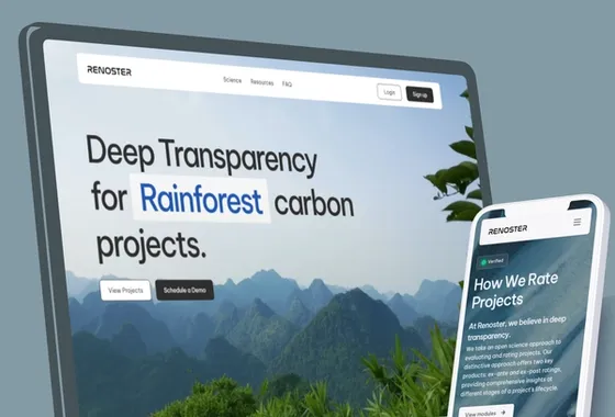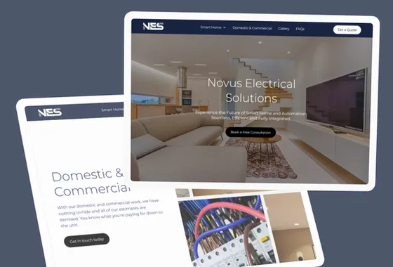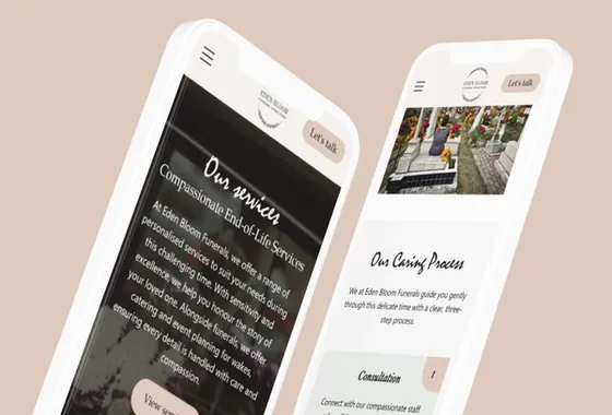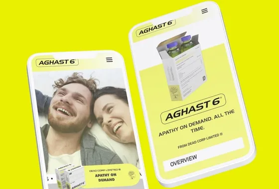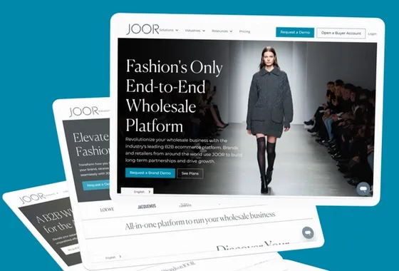

A useful SaaS homepage explains who the product is for, which job it helps them complete and what makes that approach worth considering. Start with a specific customer situation, show the product doing useful work, and give visitors a next step that matches what they already understand.
The problem with “the platform that unlocks your potential” is not that it sounds unfriendly. It leaves the visitor to work out the category, audience and practical benefit. A polished interface cannot rescue a story that could belong to twenty competing products.
Why does every SaaS homepage sound similar?
Teams often write the homepage by combining internal preferences. Sales wants every use case represented, product wants every capability mentioned and leadership wants the company to sound ambitious. The resulting sentence describes the company’s aspirations rather than the buyer’s problem.
Another cause is borrowing the language of a larger competitor. That company may already have the recognition to lead with an abstract statement. A less familiar product needs to earn that recognition by explaining itself. Similar visual conventions then make the vague wording harder to distinguish.
Collect the words customers use when describing the situation that brought them to you. Useful sources include permitted sales notes, onboarding questions and support conversations. Record the source and context. A comment from one enthusiastic user is a clue to investigate, not proof that every customer wants the same thing.
What should the opening actually say?
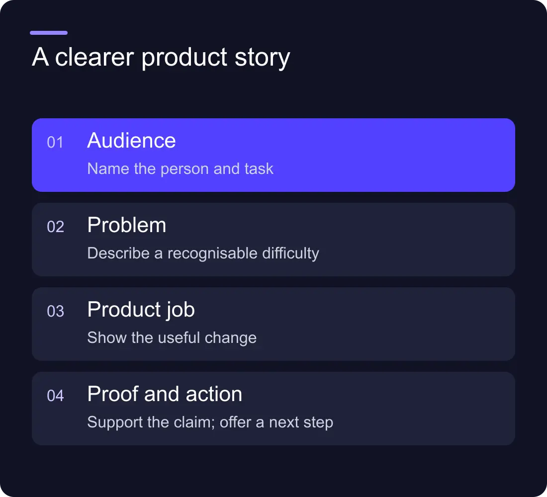
Build the opening around four connected parts: the customer, the job, the product’s approach and the next useful action. The headline does not have to contain all four. A short headline, supporting paragraph and product view can work together.
Here is a fictional example for a scheduling product. The weak version reads: “The intelligent operating system for modern teams.” The clearer version reads: “Plan field visits without another spreadsheet.” The supporting sentence could explain that regional operations teams can assign visits, see availability and share a confirmed schedule in one workspace.
That wording only belongs on a product that actually does those things. Check the promise against the current product, not a roadmap presentation. If a capability requires an additional plan or integration, make the relationship clear in the relevant detail.
The point is not to force every company into a headline formula. It is to make the meaning testable. Ask a reader unfamiliar with the product to describe what it does and who might use it after seeing the opening.
Show the task, not an unexplained dashboard
A screenshot is evidence of an interface, but the visitor may not know what to look at. Choose a view that supports the promise and add a concise explanation of the action it shows. For the fictional scheduling product, an assigned visit moving into a confirmed calendar tells a clearer story than an overview covered in tiny charts.
Use real product material where you have permission. If you simplify an interface for illustration, label it as a concept and avoid invented usage counts or customer records. A visual should explain the mechanism behind the claim, not imitate a live performance report.
An interactive product demo can help when a short sequence is necessary to understand the product. A static image or brief video may be better when the task is simple. Choose the format around what the buyer needs to see.
How do you explain several audiences without losing the main one?
Identify the primary buying situation for the homepage. Then create clear routes for secondary audiences instead of making the opening promise everything equally. A product serving operations managers and finance teams might lead with the operational task, then show how the resulting record supports finance.
Use audience or use-case pages when the difference changes the explanation, evidence or next step. Do not create a separate page merely to swap one industry noun. Each route should answer a distinct question and have enough substance to justify its own URL.
If the business cannot agree which situation should lead, resolve the positioning before debating the hero layout. The brand refresh vs rebrand guide helps distinguish a presentation issue from a decision about what the company stands for.
Put proof beside the promise it supports
Match the evidence to the claim. A customer quotation about easy publishing supports a publishing story. It does not prove that the product reduces operating costs. A product screenshot can demonstrate an available workflow; an attributed case study can explain what happened in a particular organisation.
For each important statement, write down its evidence and limitations. Record permission for customer names, logos, quotations and images. If the evidence is missing, qualify or remove the statement rather than designing a convincing badge around it.
Place useful evidence near the relevant explanation. A long logo strip at the top can signal familiarity, but readers still need to understand the work those organisations did with the product. Use descriptive links so they can inspect a case rather than accepting an isolated number.
Make the next step fit the buying stage
“Book a demo” can be appropriate for a considered purchase, but it is a large request before the visitor understands the product. A secondary route to a product tour, implementation overview or useful example can help them become ready for that conversation.
Do not provide six equally prominent actions. Choose the primary business action and one useful alternative. Describe what happens next: a guided conversation, a self-serve workspace or a short product tour. Remove surprises between the button and the destination.
Check mobile behaviour, keyboard access and the route back from the supporting material. The homepage should still communicate its offer if a video or interactive element does not load. Essential meaning belongs in visible page text.
A practical messaging review worksheet
Use this worksheet before a design review. Fill it with evidence from the current offer, then test it with people who were not involved in writing it.
| Question | What to record | Warning sign |
|---|---|---|
| Who is this for? | A specific role or buying situation | “Every business” |
| What job does it help with? | The task and present difficulty | A list of abstract benefits |
| How does it work? | A short mechanism and relevant product view | A promise without an explanation |
| Why believe it? | An attributed example or demonstrable capability | Unqualified claims and decorative statistics |
| What should happen next? | One primary action and its destination | Several competing buttons |
Review understanding before trying to measure conversion changes. If tracking is incomplete, repair it before comparing releases. Record the version, audience and period, and look at enquiry quality as well as clicks. A handful of responses can reveal wording confusion, but it cannot establish a precise conversion uplift.
Frequently asked questions
How long should a SaaS homepage headline be?
Long enough to communicate one useful idea clearly. Judge the headline with its supporting sentence and product visual, not by a fixed character target. Remove words that add tone without helping the visitor understand the offer.
Should the homepage list every product feature?
No. Lead with the capabilities needed to understand the main customer job. Use clear product and use-case routes for deeper detail, and make sure important limits or requirements remain easy to find.
Can we use an illustrated product interface?
Yes, if its status is clear and it accurately explains the intended task. Label conceptual or simplified views and do not present invented customer information or performance figures as real evidence.
Will clearer homepage messaging guarantee more leads?
No. Clearer messaging makes the offer easier to assess, but lead volume and quality also depend on audience, traffic, product fit and the enquiry experience. Measure changes against a trustworthy baseline.
Explore Hilvy’s website work and recent projects, or tell us what your homepage needs to explain.