Website animation is useful when it explains a change, gives feedback or helps someone understand a product. It becomes a problem when it delays reading, obscures controls or makes a simple task feel unpredictable. Give every animated effect a purpose, a restrained implementation and a usable reduced-motion alternative.
A polished website can move without making the visitor work around the movement. The decision should start with the task on the page, rather than the animation library you want to try.
Give motion a job before giving it a style
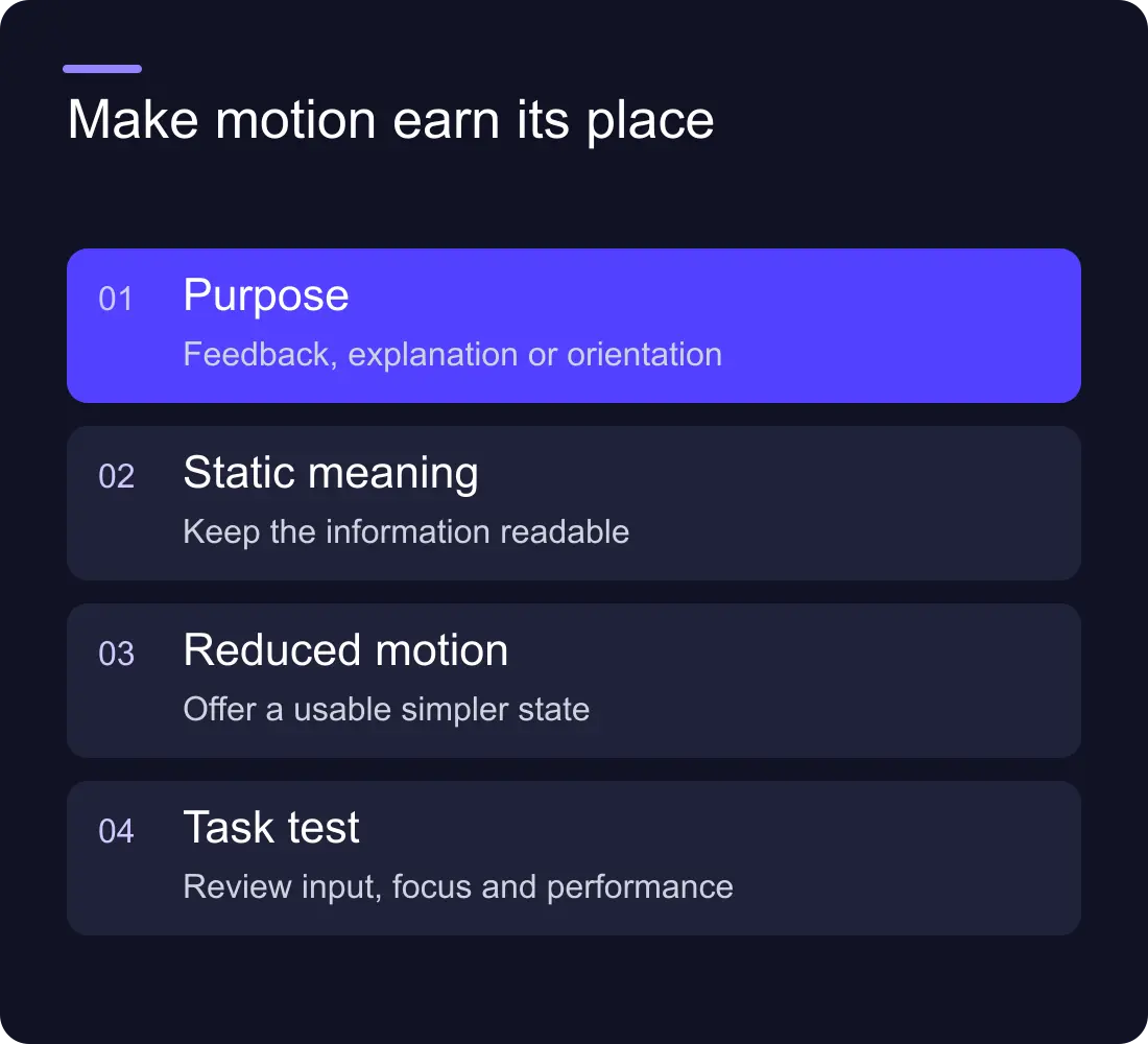
There are three useful starting jobs: feedback, explanation and orientation. Feedback confirms that a button worked. Explanation shows a relationship or product process. Orientation helps someone understand where an interface element moved.
Decorative motion can contribute to a brand's character, but treat it as an explicit design choice. It should not prevent someone reading the headline, finding the navigation or using the main action.
Write a one-sentence purpose for each effect. “Shows the selected pricing plan” is useful. “Makes the page premium” is too vague to test. If the purpose cannot be described, try the page without the effect before adding implementation effort.
Use a motion budget
A motion budget is a short list of effects the page can justify. It is not a universal limit expressed in milliseconds. Different tasks need different behaviour, and visitors use different devices and accessibility settings.
| Effect | Useful job | Failure to watch for |
|---|---|---|
| Button feedback | Confirm an interaction | Feedback depends only on movement |
| Expandable content | Explain a state change | Reading is delayed by a slow transition |
| Product sequence | Show cause and effect | The key explanation is unavailable as text |
| Scroll reveal | Introduce a section | Content remains hidden if scripting fails |
| Ambient background | Express character | Competes with text or drains performance |
Use that list during review. Several individually tasteful effects can still make one page feel busy when they run together. Check the combined experience rather than approving each animation in isolation.
A worked example: explaining an approval tool
Imagine a fictional SaaS product that routes a document through review. A useful animated demonstration shows a document being submitted, assigned to a reviewer and returned with a decision. The sequence explains the product's job.
A static version can show the same three states with labels and arrows. That gives visitors a readable alternative and gives the team a fallback if the animation is disabled or fails to load.
Now compare a spinning abstract object beside the same product heading. It may suit the visual identity, but it does not explain approval routing. Keep it only if its brand contribution justifies the performance and attention cost. Do not mistake decorative complexity for product clarity.
Our interactive demo guide covers how to choose a demonstration around a buyer's task rather than a tour of every feature.
Design reduced motion as part of the experience
Some visitors choose reduced motion because movement is uncomfortable or distracting. Respect that preference deliberately. Replace large travel, parallax or repeated movement with simpler transitions or static states where appropriate.
The W3C's Animation from Interactions guidance explains the Level AAA criterion concerning disabling non-essential interaction-triggered animation. Use it to understand the intent rather than claiming every animated page automatically fails Level AA.
Do not make reduced motion mean missing information. A product sequence should still explain the process. A selected tab should still look selected. A success message should still be visible. The essential signal needs to survive without the movement.
Keep normal scrolling predictable
Scroll effects are particularly easy to overuse because designers see them on a large screen with a precise input device. Visitors may use a small phone, keyboard navigation, browser zoom or a less powerful laptop.
Avoid making visitors complete a long scroll sequence just to reach a short answer. If a section pins during scrolling, check that navigation, focus and touch behaviour remain understandable. Give users a direct route to the important content.
Keep important copy present in the document. A reveal should enhance the presentation, not hold the text hostage until a particular script or viewport condition happens. Test a failed animation library as part of the review.
Measure the cost on the actual page
An effect that performs well in a blank prototype can behave differently beside video, analytics scripts and a large hero image. Review the finished page under realistic conditions and on devices representative of the audience.
Look for layout shifts, delayed input feedback, scrolling stutter and controls that move while someone is trying to use them. The question is whether the animation improves the task enough to justify its cost.
Use your Webflow SEO checklist alongside the motion review. Performance, accessible content and clear page structure still matter on a visually ambitious site.
Review motion with a visitor task
Give someone a simple task: identify the product, compare two options and reach the contact route. Watch whether they wait for animations, miss content or lose their position.
Then repeat with reduced motion, keyboard navigation and browser zoom. Check a small screen as well as the large design presentation. A useful review includes the static state, the moving state and the state when the code does not behave as expected.
Keep the effects that make the task clearer. Simplify the ones that compete with it. That is a stronger standard than judging whether the page looks impressive during a screen recording.
Frequently asked questions
Is website animation bad for SEO?
Animation is not inherently bad for SEO. Problems arise when the implementation hides important content, harms performance or makes the page difficult to use. Review the rendered page and the visitor task rather than treating all motion the same.
What does a motion budget mean?
It is a deliberate list of animated effects and the purpose of each one. It helps the team assess the combined attention and performance cost instead of adding movement wherever the builder permits it.
Should we remove every animation for reduced motion?
Not necessarily. Replace non-essential movement with simpler or static states while preserving information and feedback. The right alternative depends on what the original effect communicates.
How do we test a product animation?
Test whether people understand the product task, then check reduced motion, keyboard use, small screens, zoom and failed loading. Keep a readable explanation available independently of the animation.